You’ll create stunning asymmetrical jewelry balance by strategically distributing visual weight across your ensemble. Mix bold statement pieces with delicate accents, layer necklaces of varying lengths, and combine contrasting metals like polished gold with brushed silver. Balance heavier gemstones with lighter textures, use the Rule of Thirds for positioning, and incorporate negative space to guide the eye. Cohesive color palettes prevent any single piece from dominating your composition. Master these techniques to reveal sophisticated styling possibilities.
Understanding Asymmetrical Balance in Jewelry Design
While traditional jewelry design often relies on perfect symmetry, asymmetrical balance opens up a world of creative possibilities that can transform your entire look. This approach involves strategically arranging different visual elements to create balance without mirroring.
You’ll achieve equilibrium by varying sizes, shapes, and textures, ensuring no single piece dominates your composition.
Understanding visual weight is essential—factors like color, material complexity, and size influence how each piece impacts your overall aesthetic. You can guide the viewer’s eye by pairing bold statement pieces with simpler designs, creating contrast that adds depth and dimension.
Strategic pairing of bold statement pieces with delicate designs creates visual tension that draws attention and elevates your entire jewelry composition.
This technique allows for unique expressions that enhance your personal style while maintaining harmony. Asymmetrical balance transforms ordinary jewelry combinations into engaging, sophisticated looks.
Visual Weight and Element Distribution in Jewelry
When you’re selecting jewelry pieces, understanding visual weight becomes your most powerful tool for creating balanced compositions. Visual weight depends on size, color, and texture—larger, darker pieces appear heavier than smaller, lighter ones.
To achieve asymmetrical balance, you’ll need to strategically distribute different elements across your ensemble. Consider pairing a bold statement earring on one side with delicate stacked rings on the opposite hand. This distribution creates visual interest while maintaining equilibrium.
Layering necklaces of varying lengths adds depth without overwhelming your look. You’ll want to coordinate colors with your outfit, ensuring each piece’s visual weight complements your dress’s design.
Creating Dynamic Compositions With Contrasting Elements
You’ll amplify your asymmetrical jewelry’s visual impact by strategically mixing contrasting elements that create tension and movement.
When you combine warm gold with cool silver metals, or pair smooth polished surfaces against textured hammered finishes, you’re building layers of visual interest that keep the eye engaged.
These deliberate contrasts in metal combinations and texture patterns transform simple jewelry arrangements into sophisticated compositions that feel intentionally curated rather than accidentally mismatched.
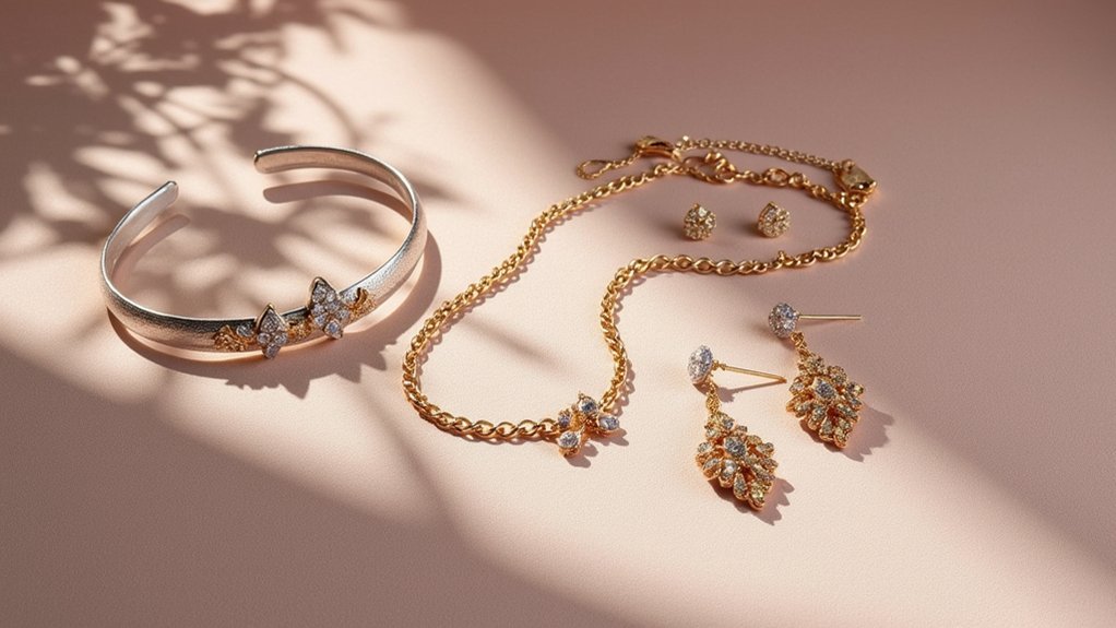
Contrasting Metal Combinations
As you explore asymmetrical jewelry styling, contrasting metal combinations become your secret weapon for creating enchanting visual tension.
You’ll create stunning depth when you pair different metals like gold with silver or rose gold with platinum. These contrasting metals draw attention to each piece’s unique features while maintaining perfect balance in your asymmetrical design. Visual elements gain prominence through strategic metal mixing—the juxtaposition highlights your jewelry’s asymmetry beautifully.
Consider weight and finish when selecting pieces. Matte textures soften your look, while shiny finishes add dramatic boldness.
Layer necklaces or stack rings with contrasting metals for versatile styling options. Remember color psychology: warm gold evokes luxury and warmth, while cool silver conveys sophistication and calm, allowing you to express individuality through thoughtful metal combinations.
Texture and Pattern Play
Texture creates the foundation for enchanting asymmetrical jewelry compositions that command attention through strategic contrast. You’ll achieve stunning visual interest by pairing smooth metals with rough fabrics, creating dynamic texture and pattern combinations that enhance asymmetrical balance.
| Contrasting Elements | Visual Impact |
|---|---|
| Thick bangles + delicate chains | Creates depth of field |
| Intricate patterns + simple designs | Prevents visual overload |
| Smooth metals + textured fabrics | Adds tactile dimension |
| Bold colors + neutral tones | Enhances color patterns |
| Layered textures + varied thickness | Establishes visual weight |
Contrasting textures work best when you consider visual weight distribution. Experiment with layering different materials—thick statement pieces balanced against delicate accents create compelling depth. Strategic color patterns highlight textural differences, making each element distinct while maintaining cohesive asymmetrical balance throughout your composition.
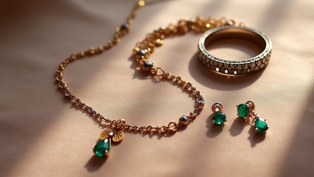
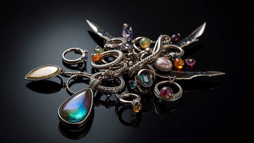
Balancing Gemstones, Metals, and Textures
You’ll achieve stunning asymmetrical balance by strategically mixing different metal textures throughout your jewelry composition.
Consider how a polished gold element contrasts beautifully with brushed silver, while the visual weight of your gemstones determines their ideal placement within the design.
Distribute heavier, darker stones opposite lighter metals and textures to create equilibrium that feels intentional rather than accidental.
Mixing Metal Textures
While smooth, polished metals create classic elegance, incorporating varied textures like hammered, brushed, or matte finishes transforms your jewelry into an enchanting visual story.
Mixing metal textures adds depth to your asymmetrical designs, creating visually striking combinations that capture attention without overwhelming your look.
When you layer different textures, balance provides the foundation for successful styling. Pair a chunky hammered silver bracelet with delicate polished gold rings to achieve dynamic contrast.
The key lies in maintaining a cohesive color palette across your mixed elements—this prevents any single piece from dominating your ensemble.
Strategic texture mixing helps you draw attention to specific focal points while creating asymmetrical balance. Your textural choices should complement, not compete, allowing each piece to contribute meaningfully to your overall aesthetic narrative.
Gemstone Weight Distribution
When you’re working with gemstones in asymmetrical designs, their visual weight becomes just as important as their actual mass. Larger, darker stones carry more presence, so you’ll need lighter metals or delicate settings to achieve asymmetrical balance.
Don’t distribute gemstones evenly—instead, vary their sizes and shapes to create cohesive flow without overpowering any single element.
Texture plays a vital role in your overall composition. Combine smooth gemstones with textured metals to establish compelling contrast while maintaining equilibrium.
Consider how vibrant hues add visual weight, requiring thoughtful arrangement when following current color trends. Your gemstone weight distribution should support complementary textures that unify the piece, allowing each stone to contribute meaningfully to your visual narrative and create truly harmonious design.
Color Theory and Tonal Harmony in Asymmetrical Pieces
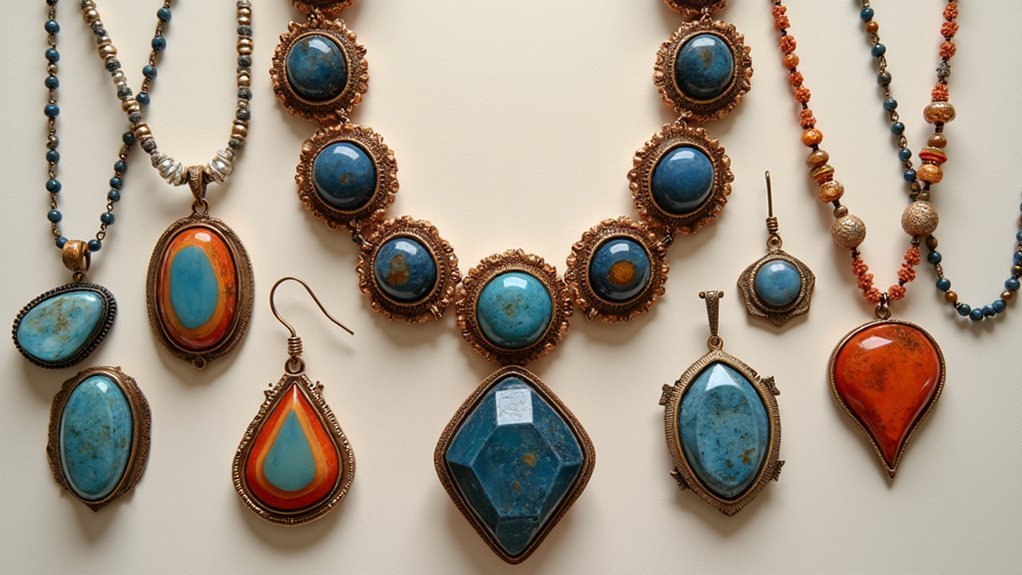
As you explore asymmetrical jewelry design, color theory becomes your most powerful tool for creating pieces that feel intentionally balanced rather than accidentally mismatched. Understanding the emotional impact of your color choices helps you select warm tones for energy or cool hues for tranquility.
You’ll achieve tonal harmony by balancing saturation and brightness, preventing any element from overwhelming your design. Complementary colors create dynamic visual interest through strategic contrast, while analogous colors provide cohesion between disparate elements.
Don’t overlook how varying textures enhance your color palette—smooth surfaces reflect light differently than matte finishes, affecting perceived tone. By thoughtfully combining these principles, you’ll create asymmetrical pieces where every component works together harmoniously despite their intentional imbalance.
Practical Techniques for Achieving Visual Equilibrium
Color mastery sets the foundation, but you need concrete techniques to transform theory into stunning asymmetrical jewelry arrangements. Visual weight becomes your primary tool for creating asymmetrical balance. Place larger statement pieces as your focal point using the Rule of Thirds, positioning them at intersection points for maximum impact. Balance plays a significant role when you offset heavy elements with delicate accents on opposite sides.
| Technique | Heavy Side | Light Side |
|---|---|---|
| Necklace Balance | Statement choker | Delicate chain |
| Earring Asymmetry | Chandelier drop | Simple stud |
| Texture Mixing | Chunky metal cuff | Thin wire bangles |
| Color Contrast | Bold gemstone ring | Subtle pearl accent |
| Negative Space | Single bold piece | Minimal additions |
Strategic negative space prevents overcrowding while guiding the viewers eye through different parts, achieving a visually pleasing composition.
Frequently Asked Questions
What Makes an Asymmetrical Image Look Balanced?
You’ll achieve asymmetrical balance by strategically distributing visual weight through contrasting elements. You’re positioning heavier objects against lighter ones, using color differences, varying sizes, and incorporating negative space to create equilibrium without perfect symmetry.
What Type of Balance Uses Circular Symmetry to Lead the Viewer’s Eye Toward the Center?
You’ll recognize radial balance as the technique using circular symmetry to draw your eye toward the center. Elements radiate outward from a focal point, creating harmony and naturally guiding your gaze inward through converging lines.
What Is the Rule of Thirds in Asymmetrical Balance?
You’ll apply the rule of thirds by dividing your composition into a 3×3 grid, then positioning key jewelry elements along these lines or intersections to create dynamic, naturally balanced asymmetrical arrangements.
Is Asymmetry and Occult Balance the Same?
You shouldn’t confuse asymmetry with occult balance. Asymmetry focuses on visual composition and aesthetic appeal, while occult balance emphasizes spiritual harmony and symbolic meaning beyond physical appearance.
In Summary
You’ve now mastered the art of asymmetrical jewelry balance through understanding visual weight distribution and dynamic compositions. You can confidently combine contrasting gemstones, metals, and textures while applying color theory principles. Don’t be afraid to experiment with these techniques—trust your eye as you create pieces that feel perfectly balanced despite their asymmetry. Your jewelry designs will captivate with their sophisticated, intentional imbalance that draws the viewer’s attention naturally.
Leave a Reply