
Color theory transforms your beadwork by turning random bead selections into intentional, intriguing designs that create emotional resonance with viewers. You’ll master complementary colors like blue and orange for vibrant contrast, or use analogous schemes for harmonious flow. Warm colors evoke energy while cool tones create tranquility, and strategic neutral placement balances your compositions. Understanding these color relationships elevates your beadwork from craft to professional artistry, and there’s much more to discover about creating stunning color combinations.
Understanding the Color Wheel for Beadwork Success

Why do some bead combinations make your eyes sing while others fall flat? The color wheel holds your answer. This circular diagram maps relationships between Primary Colors (red, blue, yellow) and Secondary Colors (green, orange, purple), giving you a roadmap for stunning beadwork.
When you position Complementary Colors—opposites like blue and orange—together, they create vibrant contrast that makes your pieces pop. These dramatic pairings grab attention and enhance each color’s intensity.
For softer, harmonious designs, choose analogous colors. These neighbors on the color wheel, such as blue flowing into blue-green then green, create peaceful shifts that feel natural to the eye.
Master the color wheel, and you’ll transform random bead selections into intentional, emotionally resonant designs that captivate viewers.
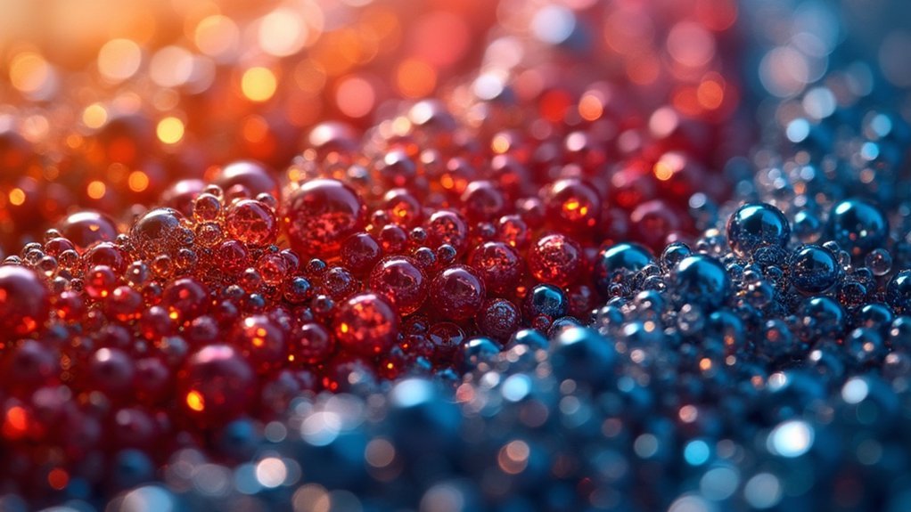
Mastering Complementary Colors for Dynamic Contrast
When you place complementary colors side by side in your beadwork, they’ll create an electric energy that transforms ordinary pieces into show-stoppers.
These opposite color wheel pairs—like blue and orange or purple and yellow—generate powerful visual contrast that makes your beadwork designs pop with intensity.
Complementary colors create electric visual tension that instantly elevates your beadwork from ordinary craft to professional artistry.
To harness this dynamic effect effectively:
- Choose one dominant color for your main design elements, then use its complement as strategic accents.
- Create balance by limiting the complementary color to roughly 20-30% of your overall design.
- Experiment with different shades of your complementary pair to add sophisticated depth.
This approach delivers a harmonious look while maintaining exciting tension.
Your pieces will command attention and showcase your understanding of professional color principles in beadwork.
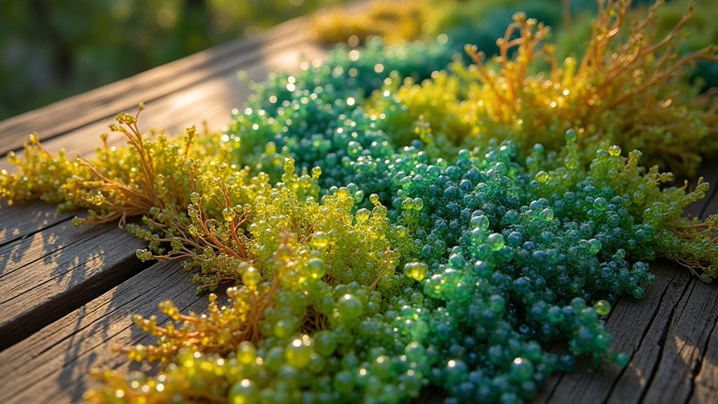
Creating Harmony With Analogous Color Schemes

You’ll find analogous colors positioned next to each other on the color wheel, creating natural partnerships that flow effortlessly in your beadwork.
These adjacent hues produce smooth visual shifts that guide the eye gently across your design without jarring interruptions.
When you select analogous color schemes, you’re tapping into their inherent ability to evoke specific emotions and set the mood for your jewelry pieces.
Adjacent Color Wheel Positioning
Harmony flows naturally through your beadwork when you select colors that sit side by side on the color wheel. These analogous colors create cohesive designs that feel balanced and unified.
Adjacent positioning guarantees your color choices work together seamlessly, producing harmonious compositions that please the eye.
Understanding adjacent color wheel positioning helps you achieve subtle shifts between beads:
- Select three consecutive colors like blue, blue-violet, and violet for maximum harmony
- Vary shades and tints within your chosen color family to add depth without disrupting unity
- Maintain dominant color focus by using one color as your primary choice while others support
This strategic approach creates a calming atmosphere in your jewelry pieces.
You’ll find that adjacent colors naturally complement each other, eliminating guesswork and producing professional-looking results every time.
Smooth Visual Transitions
Since analogous colors naturally blend into one another, they create the smoothest visual shifts possible in your beadwork designs. You’ll achieve seamless changes that enhance visual harmony without jarring interruptions or abrupt color alterations.
This natural flow allows your eyes to move effortlessly across the piece, creating a soothing, elegant effect.
When you incorporate analogous colors, you’re working with nature’s own color progression. The subtlety of these changes adds sophistication while maintaining unity throughout your design.
You can strategically balance warm and cool tones within your analogous palette to create depth without sacrificing cohesion.
These smooth color progressions greatly influence your beadwork’s emotional impact. Cool analogous schemes evoke tranquility, while warmer combinations radiate comfort and energy, letting you craft specific moods through careful color selection.
Emotional Design Impact
When your beadwork incorporates analogous colors, it taps into powerful psychological responses that viewers experience on both conscious and subconscious levels.
These adjacent color schemes create an emotional impact that resonates deeply, establishing connections between your design and the viewer’s feelings. The harmonious design achieved through analogous colors doesn’t just please the eye—it actively influences mood and perception.
Your strategic color choices can evoke specific emotional responses:
- Blue-teal-green combinations generate feelings of tranquility and natural serenity
- Red-orange-yellow palettes stimulate energy and warmth
- Purple-blue-indigo schemes inspire contemplation and sophistication
Using Warm and Cool Colors to Evoke Emotion
Color temperature serves as one of your most powerful tools for creating emotional resonance in beadwork designs. Warm Colors like reds, oranges, and yellows inject energy and passion into your jewelry projects, while Cool Colors including blues, greens, and purples create tranquil, serene pieces. Understanding these emotional responses helps you craft intentional color palettes that connect with wearers.
| Color Type | Colors | Emotions | Best For |
|---|---|---|---|
| Warm | Reds, Oranges, Yellows | Energy, Passion, Warmth | Summer themes, statement pieces |
| Cool | Blues, Greens, Purples | Tranquility, Calmness, Serenity | Winter designs, meditation jewelry |
| Balanced | Warm/Cool Mix | Harmonious, Dynamic | Focal points, versatile pieces |
| Seasonal | Temperature-matched | Season-appropriate | Holiday collections, themed sets |
You’ll create more impactful designs by strategically balancing warm and cool elements to guide attention while maintaining visual harmony.
Incorporating Neutral Colors for Balance and Sophistication
You’ll discover that neutral colors like black, white, gray, and brown create the perfect foundation for sophisticated beadwork by providing visual balance without competing with your vibrant focal hues.
These versatile shades allow you to ground your designs while ensuring your statement colors truly pop against their understated backdrop.
When you incorporate metallic neutrals such as gold and silver, you’ll elevate your pieces with an elegant sophistication that works beautifully for both everyday wear and special occasions.
Neutral Color Fundamentals
While vibrant hues capture attention and create visual drama, neutral colors form the backbone of sophisticated beadwork designs. White, black, gray, and brown create versatile foundations that enhance your overall aesthetic by providing essential balance to vibrant colors.
Neutral colors enable sophisticated layering techniques that make colorful beads stand out without overwhelming viewers.
You’ll discover three key advantages when incorporating neutrals:
- Strategic focal points – Guide viewers’ eyes to colorful or intricate design elements
- Metallic elegance – Gold and silver add luxury while maintaining cohesive looks
- Enhanced versatility – Facilitate mixing and matching various bead types seamlessly
These foundational shades create harmony in your designs, allowing for dynamic creativity without losing visual balance.
Master neutral fundamentals to elevate your beadwork from simple craft projects to sophisticated artistic expressions.
Metallic Accent Integration
Since metallics naturally bridge warm and cool tones, they transform ordinary beadwork into luxurious statements that complement any color palette.
You’ll find that metallic accents like gold and silver function as neutral colors, elevating your designs’ sophistication while creating striking contrasts against vibrant beads. These strategic additions enhance visual interest through texture and dynamic interplay between elements.
When you balance bold color choices with metallics, you prevent any single hue from overwhelming your piece.
Position these accents as focal points to guide the viewer’s eye and strengthen your composition. By combining metallics with both warm and cool colors, you’ll achieve a cohesive look that adapts to various styles and preferences, making your beadwork more versatile and appealing.
Building Color Palettes From Nature and Design Inspiration
Nature’s palette offers an endless treasury of color combinations that can transform your beadwork from ordinary to extraordinary.
You’ll discover complementary colors in sunset skies and triadic colors in blooming gardens that create stunning focal points. Earthy tones from forest floors provide grounding elements for your designs.
Here’s how to capture nature’s color palettes effectively:
- Use Adobe Capture to photograph flowers, landscapes, and textures, instantly generating custom color palettes from your images.
- Document travel discoveries by observing local color schemes and patterns that reflect regional aesthetics and cultural influences.
- Experiment with photo editing apps like Canva to test various combinations before selecting beads.
Experimenting with different approaches, including unconventional neon combinations and contemporary references like Pantone’s Color of the Year, pushes creative boundaries and keeps your beadwork current.
Frequently Asked Questions
Why Is Color Theory Important in Design?
You’ll create more visually appealing designs when you understand color theory. It helps you choose harmonious color combinations, evoke specific emotions, and make your work more striking and engaging for viewers.
Why Is Color Theory Important in Floral Design?
You’ll create stunning floral arrangements when you understand color theory. It helps you select harmonious combinations, evoke specific emotions, and convey symbolic meanings through strategic color choices that transform ordinary flowers into enchanting designs.
Why Do Artists Use Colour Theory?
You’ll use color theory to create harmonious designs, achieve striking contrasts with complementary colors, and evoke specific emotions. It helps you understand color relationships, enabling more visually appealing and impactful artistic expressions.
What Is the Color Theory of Print Design?
You’ll use color theory in print design to understand relationships between primary, secondary, and tertiary colors. You’ll apply complementary colors for contrast and analogous colors for harmony, creating visually appealing printed materials.
In Summary
You’ll discover that mastering color theory elevates your beadwork from simple craft to stunning art. Don’t underestimate how complementary contrasts create drama while analogous schemes bring harmony to your pieces. You’re now equipped to use warm and cool tones strategically, balance bold colors with neutrals, and draw endless inspiration from nature’s palette. Start experimenting with these principles today—you’ll be amazed at how dramatically your beadwork designs transform.

Leave a Reply