You’ll achieve elegant jewelry by mastering complementary color pairings like blue and orange or red and green, which create striking visual drama and elevate perceived craftsmanship. Match your metal selection to your skin’s undertones—warm tones pair beautifully with yellow and rose gold, while cool undertones complement silver and platinum. Analogous color schemes using adjacent wheel colors offer harmonious sophistication, while monochromatic approaches provide timeless elegance through varying shades within one color family. These foundational principles reveal countless sophisticated design possibilities.
Understanding Color Theory Fundamentals in Jewelry Design
While creating stunning jewelry might seem like pure artistry, understanding color theory fundamentals transforms your design process from guesswork into strategic brilliance.
You’ll discover that the color wheel serves as your essential roadmap, organizing colors into primary, secondary, and tertiary categories that guide your creative decisions.
When you master complementary colors—those positioned opposite each other on the wheel—you’ll create striking contrasts that make your pieces enchanting.
These bold combinations grab attention and enhance visual impact instantly.
Bold color pairings create immediate visual drama that draws the eye and elevates any jewelry piece from ordinary to extraordinary.
You can also explore analogous colors, which sit adjacent on the wheel, offering harmonious aesthetics for cohesive designs.
Additionally, triadic schemes provide vibrant energy through three evenly-spaced colors, while monochromatic approaches using various shades of one color deliver sophisticated elegance.
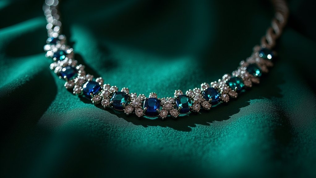
Complementary Color Schemes for Maximum Visual Impact
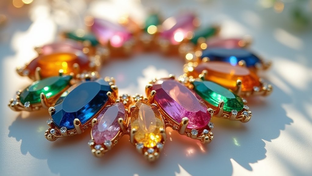
When you position colors directly opposite each other on the color wheel, you’ll create complementary schemes that deliver unmatched visual drama in your jewelry designs.
These powerful color combinations, like blue and orange or red and green, instantly grab attention and make your pieces irresistible to viewers.
You’ll find that complementary color schemes dramatically boost your jewelry’s visibility while highlighting intricate details and precious gemstones.
The striking contrasts don’t just catch the eye—they elevate perceived value and craftsmanship.
When you master these combinations, you’ll evoke specific emotions in your audience. Blue-orange pairings balance tranquility with vibrance, creating sophisticated appeal.
Your complementary color choices guarantee each piece stands out while maintaining harmony with the wearer’s style, delivering maximum visual impact that transforms ordinary jewelry into extraordinary statements.
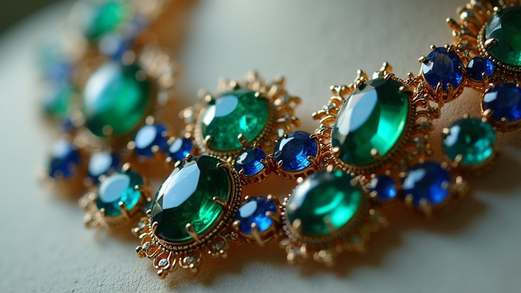
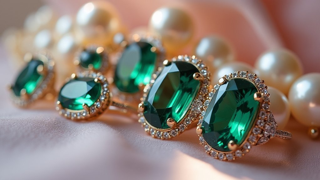
Analogous Color Palettes for Harmonious Jewelry Pieces
Adjacent colors on the color wheel create analogous palettes that’ll give your jewelry designs a naturally flowing, sophisticated appearance.
These analogous color palettes work exceptionally well because they share common hues, creating seamless shifts that feel visually comfortable and elegant.
You’ll find that beautiful color combinations like blue, blue-green, and green evoke tranquility while maintaining sophistication. This approach allows you to incorporate complementary gemstones such as turquoise and emerald, enhancing your piece’s visual depth without overwhelming the eye.
The versatility of analogous schemes means your jewelry flows effortlessly between casual and formal occasions.
You can experiment with different shades and tints within your chosen palette, creating unique pieces that express your personal style while maintaining that harmonious, polished look that makes jewelry truly enchanting.
Metal Selection and Color Temperature Coordination
You’ll discover that matching your jewelry’s metal temperature to your skin’s undertones creates a naturally flattering effect that enhances your overall appearance.
Warm undertones pair beautifully with yellow and rose gold, while cool undertones shine brightest with silver and platinum selections.
Understanding this fundamental relationship between warm and cool metals helps you make confident choices that complement rather than compete with your natural coloring.
Warm Vs Cool Metals
Since metal choice forms the foundation of any elegant jewelry piece, understanding the distinction between warm and cool metals becomes essential for creating sophisticated color combinations.
When you have warm undertones in your skin, yellow and rose gold will enhance your natural glow and complement your complexion beautifully. These warm metals create a harmonious connection that radiates richness and vibrancy.
Conversely, cool metals like silver, platinum, and white gold work exceptionally well if you have cool undertones. They’ll give you a crisp, sophisticated appearance that feels modern and elegant.
If you’re blessed with neutral undertones, you can confidently wear both categories, allowing you to match metals with different outfits and occasions for maximum versatility.
Skin Tone Matching
While choosing the right metal provides your foundation, coordinating that selection with your skin’s unique color temperature creates the most flattering and elegant result.
Skin tone matching determines whether you’ll shine in warm or cool metals. If you’ve got warm undertones, yellow and rose gold will enhance your natural radiance, while cool undertones are beautifully complemented by silver, platinum, and white gold. Those with neutral undertones can confidently wear both categories without clashing.
Your gemstone color schemes should follow the same principle. Warm-toned stones like amber, citrine, and garnet pair perfectly with warm undertones, while sapphire, amethyst, and aquamarine enhance cool undertones.
This coordinated approach guarantees your jewelry harmonizes seamlessly with your natural coloring.
Gemstone Color Psychology and Emotional Resonance
Countless civilizations have attributed mystical powers to gemstones, but modern jewelry design leverages something far more tangible: the scientifically-backed psychological impact of color.
Understanding gemstone color psychology helps you select pieces that create genuine emotional resonance with your personal needs and style.
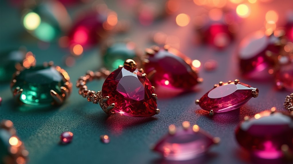
Red garnets channel passion and energy, perfect when you’re seeking confidence and liveliness.
Blue sapphires promote calm and tranquility, ideal for stressful periods requiring mental clarity.
Yellow citrine radiates joy and positivity, making it excellent for uplifting daily wear.
Green emeralds symbolize growth and renewal, resonating with those pursuing balance and harmony.
Purple amethyst connects to spirituality and intuition, inspiring deeper reflection and meaningful connections.
You’ll find that choosing gemstones aligned with your emotional intentions transforms jewelry from mere decoration into powerful personal expression.
Seasonal Color Trends in Contemporary Jewelry
You’ll find that seasonal color trends transform how you approach jewelry selection, with each time of year offering distinct palettes that enhance your natural beauty.
Spring and summer call for lighter, cooler tones that complement warmer weather and brighter days, while autumn and winter invite richer, deeper hues that reflect the season’s mood.
Smart jewelry choices include adaptable pieces that work year-round, allowing you to build a versatile collection that adapts seamlessly across seasons.
Spring Summer Color Palettes
As nature awakens with fresh blooms and longer days, spring summer color palettes in jewelry mirror this seasonal transformation through light, warm, and vibrant hues that capture the essence of renewal and energy.
You’ll find spring’s perfect color combinations emerge when pairing gold metals with pastel gemstones like aquamarine and rose quartz.
Summer calls for silver and white gold alongside cool-toned stones such as blue topaz and amethyst.
Transform your seasonal style with these enchanting palettes:
- Coral and turquoise – evokes ocean sunsets and tropical escapes
- Soft greens with gold – channels blooming gardens and fresh growth
- Pastel blues with silver – mirrors clear summer skies
- Rose quartz with warm metals – embodies gentle morning light
These bold contrasts and layered pieces refresh your look while celebrating nature’s vibrant awakening.
Autumn Winter Jewelry Tones
When leaves begin their dramatic transformation from green to gold, autumn winter jewelry tones shift toward the season’s deeper, more luxurious palette.
You’ll find rich, warm shades like deep reds, burnt oranges, and earthy browns dominating these collections, perfectly complementing cooler weather wardrobes.
Gold and rose gold metals become your go-to choices, enhancing autumn’s natural warmth while adding luxury to winter attire.
You can embrace gemstones like garnet, citrine, and amber that capture fall’s vibrant essence and winter’s cozy richness.
Consider layering darker jewel tones such as emerald green and sapphire blue for dramatic winter flair.
These autumn winter jewelry tones create sophisticated color combinations that align with seasonal moods, making your pieces both trendy and timelessly elegant for the colder months ahead.
Year-Round Transitional Pieces
Smart jewelry investments bridge seasonal gaps by incorporating adaptable color palettes that work beautifully across multiple months.
You’ll maximize your collection’s versatility by choosing pieces that shift effortlessly from spring’s pastels to autumn’s rich tones.
Strategic color combinations enhance your jewelry’s year-round appeal:
- Mix metals thoughtfully – pair gold with emerald greens for fall sophistication or silver with soft summer blues.
- Choose complementary undertones – warm skin tones shine with gold and rose gold, while cool undertones flourish with silver and white gold.
- Layer strategically – combine pieces with seasonal colors for dynamic styling options.
- Select adaptable gemstones – opt for versatile stones that complement multiple color palettes throughout the year.
You’ll create endless styling possibilities while building a cohesive, elegant collection.
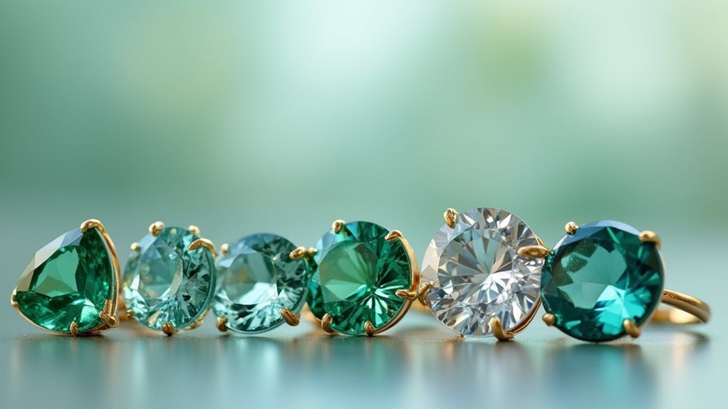
Monochromatic Schemes for Sophisticated Elegance
While bold, contrasting colors certainly make a statement, monochromatic color schemes offer an entirely different path to sophisticated elegance in jewelry design.
Monochromatic color schemes create sophisticated elegance through harmonious tones rather than bold contrasting statements in jewelry design.
You’ll discover that working within a single color family creates remarkable depth through varying shades and tints, adding that essential touch of elegance to any piece.
When you choose monochromatic approaches, you’re tapping into powerful emotional connections—calming blues for serenity or warm reds for passion.
You can enhance visual interest by incorporating different textures and materials within the same color family, creating dimension without breaking the harmonious flow.
The versatility you’ll gain is unmatched.
Monochromatic jewelry effortlessly shifts from casual daywear to formal evening occasions, making these pieces invaluable investments for your collection.
Contrast and Balance Techniques in Multi-Stone Designs
When you’re working with multiple stones, you’ll create the most striking pieces by pairing complementary colors like emerald green with ruby red.
You’ll also need to contemplate visual weight distribution by balancing bold stones such as amethyst against softer hues like pale pink.
Strategic placement and varying stone sizes will help you achieve depth while maintaining harmony throughout your design.
Complementary Stone Pairings
Because complementary colors sit opposite each other on the color wheel, they create the most striking visual contrasts when paired in jewelry designs.
You’ll discover that complementary pairings like blue sapphires with orange citrine or deep emerald green with light pink rose quartz produce stunning visual dynamics that enhance each stone’s individual beauty.
These color combinations can evoke powerful emotions in your jewelry designs:
- Blue and orange stones convey calmness paired with energetic vibrancy
- Purple amethyst with yellow citrine creates luxury meets warmth
- Red garnets with green emeralds evoke passion balanced by tranquility
- Pink tourmaline with green peridot suggests romance harmonized with growth
Consider color saturation and tone when selecting your stones.
Use balanced ratios—one dominant stone with two supporting complementary stones—to create visually pleasing, emotionally resonant pieces.
Visual Weight Distribution
As you arrange multiple stones in a single piece, visual weight becomes your most powerful tool for creating balanced, sophisticated designs.
You’ll achieve harmony by pairing lighter stones with heavier, darker ones through strategic contrast techniques. Color combinations work best when you apply color theory principles—complementary hues enhance visual interest while preventing any single stone from dominating your design.
Position larger, darker stones alongside smaller, lighter ones to maintain equilibrium throughout your piece.
You can create cohesive elegance through symmetrical arrangements that mirror stone placement. Visual weight distribution improves dramatically when you incorporate varied textures and finishes, mixing matte and glossy surfaces to draw attention across different design elements while maintaining overall balance and sophistication.
Color Combinations for Different Skin Tones and Occasions
Understanding your skin’s undertones transforms how you select jewelry colors, creating harmonious combinations that enhance your natural beauty.
Warm undertones flourish with yellow and rose gold paired with amber and citrine, while cool undertones shine in silver, platinum, and white gold alongside sapphire and aquamarine.
If you’ve got neutral undertones, you’re lucky—you can effortlessly mix both warm and cool metals.
Seasonal colors further refine your choices:
- Spring/Summer: Light pastels in gold settings create fresh, radiant looks
- Autumn/Winter: Rich, earthy tones in warmer metals add sophisticated depth
- Formal occasions: Bold emerald or ruby statement pieces command elegant attention
- Casual settings: Simple, versatile pieces reflect your authentic personal style
These strategic color combinations guarantee you’ll always look polished and intentional.
Professional Tips for Testing and Refining Color Choices
When selecting jewelry colors moves beyond intuition into professional territory, systematic testing becomes your most valuable tool for achieving stunning results.
You’ll want to use a color wheel to identify complementary, analogous, and triadic schemes that enhance your designs’ visual appeal. Test your color combinations under various lighting conditions, as natural light greatly alters color perception.
Create small sample pieces to observe how different colors interact with actual materials in real contexts. Digital design tools let you visualize modifications before committing to physical materials, ensuring cohesive looks.
These best practices include seeking feedback from peers and potential customers to gauge emotional responses. Their insights help refine your choices, transforming good color combinations into exceptional ones that resonate with your target audience.
Frequently Asked Questions
What Color Is Sophisticated and Elegant?
You’ll find deep jewel tones like emerald green, sapphire blue, and ruby red create sophisticated elegance. Classic neutrals including black, white, and gray remain timeless, while metallics add luxurious refinement.
What Colors Evoke Luxury?
You’ll find that rich jewel tones like emerald, sapphire, and ruby instantly convey luxury. Metallic gold and platinum create opulent appeal, while deep burgundy and navy add sophisticated refinement to any design.
What Color Jewelry Is Most Attractive?
You’ll find pink, gold, and neutral combinations most attractive since they symbolize love while staying versatile. Dark jewel tones like ruby and emerald also create striking, luxurious appeal that commands attention.
What Is an Elegant Color Palette?
You’ll find elegant color palettes feature neutral tones like whites, creams, and grays alongside metallics such as gold and silver. They include classic deep hues and soft pastels for sophisticated, refined appearances.
In Summary
You’ve learned that mastering color combinations transforms ordinary jewelry into stunning statement pieces. By understanding color theory, choosing complementary or analogous palettes, and considering skin tones, you’ll create designs that resonate emotionally and visually. Don’t forget to balance contrast with harmony, coordinate metals thoughtfully, and test your choices thoroughly. With these techniques, you’re equipped to craft elegant jewelry that captivates and connects with wearers on every occasion.
Leave a Reply